The Smithsonian's homepage banner and slideshows on our Explore landing pages for Art & Design, History & Culture, Science & Nature, etc. can be a great way to promote your content. Additionally, content can be featured within the main "promotion grid" of the homepage and on the Explore landing pages.
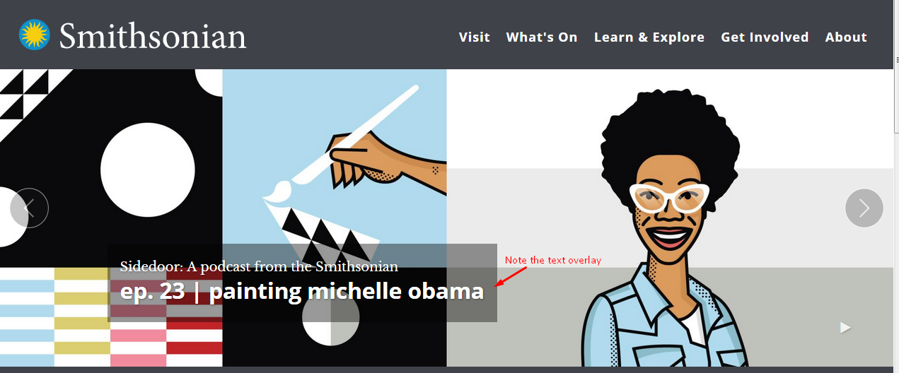
To be considered for the Smithsonian's homepage and/or promotion grid, the content should appeal to a general audience, include an excellent high-res image without text, and have high-quality Smithsonian content to link to. The homepage and landing page banners are not used for non-Smithsonian promotions, links to non-Smithsonian sites, commercial offers, press releases, or staff announcements.
Technical Specifications
Homepage banners require an image 2560w x 850h. This single image will be cropped manually for smaller desktops, tablets, and mobile with different aspect ratios. To make sure your image can be cropped, consider aspect ratios below. Due to the difficulty in accommodating differing aspect ratios, we cannot accept images with text. Additionally, you will see that banner text will overlay your image on the bottom left side of the image, so we cannot support competing text.
Banner image sizes for a full-width slideshow are:
- wide desktop: 2560 x 850 original (minimum dimensions)
- full desktop: 1920 x 640 manually cropped derivative
- tablet: 800 x 480 manually cropped derivative
- mobile: 400 x 300 manually cropped derivative
Banner image sizes for a Explore page slideshow (ex: Explore Art & Design) are:
- Desktop: 600 x 420
- Mobile: 320 x 270 manually cropped derivative
Banner Text Requirements
On the homepage, the banner text has set font and sizing for each line, and the banner itself stays in the same place for consistency. The length of text needs to take the photo it highlights into consideration. Keep in mind that this is a headline, not a paragraph.
The banner will resize the source and headline text for mobile phones and tablets, and drop the tagline.
It's good to visually compose your banner with this information in mind. You can size your desktop window (by dragging the corner) to see how it will look on a tablet or on phone.
Desktop full-width banner:
Same full-width banner image cropped for mobile:
